
role
November 10th, 2009
Based on this news item.
Those readers with an eye for such things may have noticed that the artwork has been tidied up a little bit. I hope the new look is less ugly than the old, and that regulars won’t object too much. It is something that I have been wanting to do for a long time.

I guess we’ll get used to it but I really liked the old ones and all our t-shirts and mugs have the old version.
Now Jesus and Mo’s body doubles have body doubles!
I like the old drawings. These look too much like the Peanuts characters.
i guess it will take some getting used to. i didn’t think the old look was that ugly.
I didn’t want to do this because art is so personal and this strip is really about the content, not how Jesus & Mo are drawn… but… the new look isn’t so good. The faces (as previously mentioned) look like Peanuts characters and the arms seem to lack any definition at all, just being thick spaghetti strands with no elbow or bones to speak of.
I also prefer the old style, but probably because it’s what I’m used to seeing. I think the low-fi look of the old style actually worked better than more realistic art, because it provided a contrast to the high-brow concepts.
But then, every comic artist who’s done a noticeable shift in drawing style has gotten a lot of “I hate it!” pushback from the fans, and within a month or three nobody cares any more. Keep evolving your drawing style—maybe add some elbows—but always make it so that you enjoy creating the strip, because that’s the key. So long as the dialogue stays sharp (and I know it will), the art will be fine either way.
I vote for the old images as well. But I can get used to this so long as the satire and irony (truth) continues to be as great.
However, author has a good point here. Believers believe believing is knowing. So much the better for faith . . . er . . . knowing.
I agree, I much prefer the old look. The new look is far too, well, cartoony! Still, I’m sure it will grow on me.
Nevertheless, congratulations on getting into the Telegraph ten best list. “Do not click on the link if you are easily offended”, they say! – ridiculous. I also notice they weren’t brave enough to show the part of the cartoon with Mo on it. What a cowardly yellow-bellied Britain we now live in.
The old look was definitely better. Too used to it.
Another vote for the old versions, although as Eric says above, whenever anything changes (webcomics, Facebook, Opal Fruits) there’s always an outcry and after a short time no-one really notices. At the end of the day J&M is about the satire, not the drawings.
Art is in the eye of the beholder, but in my eye is a little tear. But hey, I have lousy eye for art, and the artist has an eye too.
I’m ok with the new look – as long as you haven’t changed the barmaid too
The Guardian headline — ‘Muslim not “true” murderer’ — is brilliant.
The first thing I thought was “What?! Mohammad has Charlie Brown eyes!” 😉
I quite like the new artwork. The noses look very good, although I’d say Jesus’s new algal beard is a step down from the old hair bush look. I can overlook the spaghetti arms as a stylistic thing, too; my only gripe is that I really don’t like pinprick eyes. They do work-ish for Mo, but they make Yesh look somehow too… innocent!
Object! Object! The eyes… The curves… The darkness… It’s just too much. I’m all for updating looks, but I prefer the old. Just don’t change the eyes. Oh, and the noses.
I really like it. And so does my cat.
Ooo new artwork. I like the old but it is good to see progress.
Maybe you could do a guest artist slot. Here’s how I see them
Oh hang on I can’t post images never mind
I like the new artwork.
@DragonsDream: The arms were always spaghetti like (though J had shoulders and M had elbow nubs). I think it’s just more obvious now that everything else has been upgraded.
Prefer the old look, but I’ll get used to it.
lol…While reading the comments I couldn’t help imagining a terrorist snoopy…
———————
I’m okay with the new art…But there was nothing wrong with the old one…change is never easy to accept…It doesn’t mean it’s not good…
———————
Great comic…It shows that what matters is not how you look, but whether you are a polygamist/pedophile or not…
Change is bad.
The new look is terrible. Far less character – it’s just bland and dull now. The drawings were part of the charm. Or would you prefer to see South Park updated in a nice ray-traced 3d style?
You *need* the eyes as they were, especially in Jesus’ case.
Seriously – go back.
I thought you had a guest artist for a moment. Please don’t change the t-shirts and mugs, tho.
Oh, no… please, go back to the old art style. It didn’t look crappy, and the new style doesn’t improve on it in any way; it only distracts needlessly.
The shift in artwork is striking. If it seems off, that’s mostly because we’re used to your older style. It’s your work: continue to experiment as you see fit.
As long as you can sustain the same level of humor and deadpan hypocrisy in the dialogue, the art is largely irrelevant.
Throughout history most of god’s spokesmen have been thieves, killers, perverts, illiterate and liars.
The old art was not ugly! I don’t like the new art at all. In fact, I will get a Fatwa to condemn it and make you go back to the old art. Well, at least the first part.
I think I liked the old ones better… the new ones make them look way more innocent than they are.
@Anthea (from previous) Thats pretty funny- but there are already some who think that Copernicus has a lot to answer for for moving the whole planet from the centre of the universe, where it rightly belongs!
@Art critics. Perhaps the new style will allow for more range of expression?
Mo is wearing contact lenses now and Jesus has had a whole body job! mmmm…
One more voice in favour of the old look. They used to look natural and original, now they look cartoonish ;-). Content as usual – brilliant.
Hey, this is just an excuse to buy another T shirt. That’s cool.
I was never ever struck with the idea, that the artwork needed to be changed. Anyways; I am too addicted to Jesus&Mo to not give this new art a try, and yes; I’ll probably end up getting to know and love it.
The new work is boring and mundane. It looks like every other line cartoon, which also makes the limitations more apparent (now, you’re stylistically comparable to many other cartoons, where before you were fairly unique and therefore didn’t fail in comparison to others).
Aka, it looks cheesy.
Am used to old, but grateful for both old and new looks.
Mo is much more studly-hot!
Jeez has weird, boneless jellyfish arms.
I personally believe that Jesus had a much more scraggly beard than the new one! It’s too perfect now.
I rather preferred the old look too, and not because it was old, but because its scratchy cheapness added an extra layer of comedy. This looks a bit too slicked up and Sunday-strip for me.
Aww… I don’t mind updating your drawing styles occasionally, but Jesus’ constantly surprised look was one of my favorite parts of the comic.
Great strip!
I’m italian, and I’m NOT on the side of Mrs Santanchè (’cause she is a damn fascist and a rich total moron), I can add something funny.
You probably know our premier Berlusconi (a sexist 73 years old with BOTH the power of Murdoch and Obama in my country). Lots of scandals all over the years. He’s a polygamist in the religious term (two marriages) and he’s suspected of having a relationship with a young girl before she became 18 (in Italy is a crime). He still answers to the press (the REAL Italian Press, not cowards under his power) that he’s elected by the people (false, we’re a parlamentary republic) and he’s got the 68% consensus (false too). So probably he thinks he can do all the fuck he wants (like Hitler).
A popular web joke these days says:
Santanchè: “Mohammed is a Paedophile and a Ploygamist”
Mohammed: “I’ve got the 68% of consensus”
PS. Sorry for my bad english
This regular is NOT a fan of the change. These are not the same characters we know.
Like other commenters I preferred theold lo-fi drawing style but, hey, your cartoon your way. The wit is sharp as ever.
I prefer the old style. It was retro (like the characters’ time) and fun in its own way, with the lines and all. This new design makes it like a regular comic.
thanks for all the work on this strip, I really love it, but sorry…I too prefer the old style. Jesus in particular looked a lot better. The wide-eyed look had something of an innocent madness about it.
I’m all for progress. Stick to the new artwork, Author.
I think the author is joking with us…are you crazy man? This new draw is ridiculous (i´m sorry, but think about)!
I love the old jesus´s face. this new one is not funny at all. I understand that you wants to do something different but…try again.
I thought only Catholics, Christians, Muslims, Pagans, Hindus were afraid of change. I had hoped we were all open to change and new ideas. Alas Author has freed us from the bonds of our mental slavery. This will usher in a new age i.e. BNA (before new artwork) and ANA (after new artwork)……
I liked the old look better, but I’m sure I’ll get used to it. I really, really, don’t like their eyes though… They just look funny, kind of like they lost their humanity when you redesigned. Change the eyes a little, and I’ll be a happier woman-with the new design, that is.
I was quite disappointed to see the new graphics. Much prefer the old ones that were nicely crude and a bit wonky.
Could everyone pipe down about the artwork please and concentrate on the gag? I find it quite interesting that theists have to do these mental sumersaults to avoid admitting the truth. Fortunately there are always some that eventually recognise that they are deceiving themselves and change sides. What do you suppose the odds are that this will happen to Mo?
Ost – your English is perfect; better than a lot of native speakers you sometimes read on the net (no one in the above list, of course!)
Re the gag – how do Muslims reconcile Mo’s paedophilic history? Do they all secretly go around thinking that it is okay to have sex with 9 year olds because the Perfect Prophet did it? Or if they are appropriately repulsed by the idea, how do they stay in the religion? Of course, I am aware that believers of all stripes are capable of some astounding mental gymnastics (which is the point of the strip) and perhaps it is because I can’t understand how they do this that I am not a believer.
Re artwork – didn’t notice until I read Author’s note about it! However, with several commentators mentioning the Peanuts, now I can’t help seeing Barmaid as Lucy with her therapy stand! Preferred the Big J’s hair and beard in the previous version.
I like the old eyes much better. They have a sort of Michele Bachmann zombie look that is more in keeping with Jesus and Mo’s characters.
the new eyes look a like too much like the Peanuts.
But, changes in drawing happens over time to all cartoons – characters become sleeker – look at Garfield – he started out much fater, claws and teeth and spike hair – and became more rolypoly smooth over time.
but, as to the strip, the joke is bang on – religion, you get it or you don’t and if you don’t, you’re not allowed to critique it.
science asks questions that may not be answered
religion offers answers that may not be questioned
oh author, I’m a big fan of the old art style! it had something… I will miss it dearly.
No no no, Author! The old style gave Mo a distinctly manic look that worked especially well when he had his burqa on. And the old Jesus looked like a Californian stoner. The over-all improvised look of the strip was integral to the humour.
This could be the most disastrous cartooning makeover since Walt infantilised Mickey and took his teeth and malice away. Please tell us this is a hoax!
New look is awesome! Love the comic…please don’t stop!!!!
I preferred the old art work; it simply stylistically different to every other comic strip out there. As someone said, it is too much like the Peanuts family. Mixed with Garfield. In my opinion, anyway.
And that is what I believe. And I am not ignorant, because to believe is to know!
i also like the old jesus and mohammed, i dont like this new drawing. Eyes its to much like the Peanuts.
please bring BACK old jesus and mohammed
i think Jesus is thin
FWIW–I miss the old faces. Esp. Jesus. He just doesn’t look clueless enough today.
It’s the jokes that matter, we’ll get used to the new look.
Still, Charles Shulz is (not) rolling in his grave.
Hi, I’m a long-time watcher, first-time poster.
I’m sorry to see this upgrade. Sorry to add to the clamour, but I preferd the older style to this. I find it looks to “clean” – however unclear that is, it’s the best way I can explain it.
Of course, it’s your comic, you’re free to do what you will.
Who are these impostors! Who dares to pose as our old J and M? I hope the familiar faces come back soon. It’s as bad as a TV soap replacing characters with new actors. 🙁
Really like the joke but don’t like the new eyes. The new hair is rocking though:)
I don’t care for the artistic change, but it may just be based on familiarity with the previous style.
A tough decision author. I’ve not counted, but I get the feeling there are a lot more ‘Nays’ than ‘Ayes’. And it’s the eyes that make the most difference I think. Jesus’s stunned/stoned expression seemed somehow to sum it all up. Plus, I liked his lop-sided crown. And Mo’s better without a mouth. Now they look somehow too much like little cartoony people.
I’m not against change. I’m trying to like it. But…
It’ll probably just take time.
I like the old look too. I agree that the new eyes look like something from Peanuts, or I thought they looked like something from the cartoon show Doug when I first saw this.
You had the style before, this is just more average in my opinion…
Also Mo’s words are wise as always ;D
Joke good, drawing bad. Leaves a bad taste behind my eyes.
I vote for nay as well.
Do we get a vote? 🙂
I feel this is just a cynical ploy to bring this new style in, have most be against it, then have an avalanche of hits when you bring back the old style as “Jesus ad Mo Classic”.
But yeah, I prefer the old style. Bring it back!
@Bill: It’s called “cognitive dissonance”: The ability to be selectively blind to the illogic of certain subjects. Reasons why vary, but there seem to be two main ones: It feels good to do so, or there’s money in it.
@Author: Can I suggest a blend of the old and new styles? The startled stoner J really needs to stay, even without the scraggly hair-do and bedsheet cloak. And the old M had that hard-edged Bedouin look, perfect for cynicism and those threats of random violence. Whereas the new one is a bit too soft and reasonable looking.
Nooooooo!!!! The old style was funny as!
Mo looks too serious and Jesus is kinda cute. Not the desired effect, I bet.
Go back to the previous or we call a Jihad upon you.
I miss the old art. Mo had this wild look in his eyes that used to just crack me up.
I do like the cleaner outlines of their (svelte!) figures, and Mo’s lid has never looked better. Any chance you could keep the new bodies and just copy-paste their old facial expressions? Seriously, if cutting and pasting was good enough for the authors of sacred religious texts, it ought to… nevermind, haha.
Eh…I don’t mind Jesus too much here, but Mo needs to lose those little lines at the sides of his eyes, they look goofy. Overall, the old artwork was better, not because of any artistic value (at least, I wouldn’t know), but because they wide-eyed look of disbelief fit the comics purpose so well. Also, the crown of thorns looks less like thorns here and more like a hippy headband.
No. No. Nonononononononono. No.
Both characters lose something with the new artwork, and gain little.
Minor changes in orthodoxy can be the cause of irrevocable schism! Good job you didn’t go the whole hog!
Excellent stuff, as usual.
Am I alone in finding an irony in a strip that consistently lampoons humanity’s inability to see things differently and change outmoded practices in the light of new evidence having comment after comment which?…oh never mind.
Just gradually let Jesus’ hair get longer and maybe we won’t notice.
@Daoloth – of course we get it!
Have you never noticed that practising atheism is based on the ability to belabour the obvious?
Even this crusader says: bring back the old J&M!
WHAT? You replaced Mo’s body double? I think we can officially declare that this strip has now jumped the shark… disappointing for me, as a long time reader and newly come commenter.
Seriously though, I like the tidying up of the furniture etc, but I think the faces have lost of character. I hope the barmaid hasn’t been too airbrushed.
Sorry to say, but I prefer the old style. The guys look more sympathetic that way. The new look is too clean – specially Jesus.
I wonder what has become (or will become) of Moses…
We’ll have to get used to it, I believe.
At first, I thought this was a guest-comic made by a 10-year-old. No offence meant, but it’s no secret you’re don’t hold the world record in drawing, but that didn’t matter with the old style, because it had charm and obviously wasn’t meant to look pretty. This new style looks like you are TRYING to make it look good – and failing terribly – which makes it much worse. And yes, Mo had a perfect facial expression before. Now his eyes look like Tintin.
I too, prefer the old style. Especially the eyes. The new eyes are too cute and fluffy, while the old eyes were appropriately wild and staring like any religious fanatic would want them to be.
Besides, the old J&M were icons. You don’t change icons. And what’s with this ‘wanting to clean up the image of J&M’ bit?!
Sir, I am outraged.
Maybe /slower/ transitions would be more to the liking of the faithfuls? I’m also for the old look, but Author is all-seeing, all-benevolent, and know what is best.
I would suggest changing the littlest things every week, and before you know it, even the hafiz of jesusandmo will be OK.
Not only was he a paedophilic polygamist, Mo was a blood thirsty warlord intent on conquest.
More importantly: I think your new faces have lost a lot of the expressiveness of the old. Jesus’s permanently querulous (or stoned) look and Mo’s constant scowl was more apparent with the old style. I think you should revert to the old face style (eyes, noses, mouth for Jesus, and gap between moustache and beard for Mo).
Oh no, bring ’em back.
Author , no!
No No No No No No.
Nein. Niet. Non.
(please bring them back)
Oh dear…I prefer the old artwork…these new guys look a bit too Peanutsy…sorry. Not that my addiction to J&M will subside, though.
The satire and thought-provoking humour is what really matters here and I’m confident our admired Author has still plenty of it.
However, the “rough-ugly” old look was an integral part of the cartoon effectiveness. Despite (or because of) the old faces’ crude drawing, Jesus and Mo were incredibly good at conveying the precise expression required in each frame. Their eyes never failed to show the right emotion: smugness, determination, ignorance, fanaticism, naivety, surprise, speechlessness, etc. How could this miraculous versatility be achieved? Well, the Lord works in mysterious ways… The Author noble attempt to sanitise their faces has sadly taken away Jesus & Mo divine ability to express their emotions – Allah/God’s magic is gone from the cartoon.
I remember an old favourite where Mo told the Barmaid to look at them because they were clearly product of an “Intelligent Designer” and the Barmaid end up saying they were more likely to be product of an “Incompetent Designer”. I think this is the only time the Barmaid has been wrong. Well, she is only human…
I liked the roughness of the old cartoons. But the style of a comic strip evolves over time as my collections of Peanuts and Bloom County clearly show.
didn’t notice till you pointed it out – but i like the old eyes better. Does this mean we have to get out a permanent marker and change the eyes on our T shirts?
On the off chance that this is one of those democracy things, I’m going to have to vote for the old style too. It just seems to have more relevance to the material.
And yes, I am aware that this is probably just because it is the style I/we am/are used to…
OK, I am getting more and more confident that the new look is a joke in a joke. Good job, Author! 😀
Oh please revert to the old style – it was just great! I am not sure I can get used to this… 🙁
Please, PLEASE, bring back the old drawings. They made me laugh every time, even if the content wasn’t the funniest ever. Jesus as a waif was perfect. And Mo wants his old exterior back as well. He says: min fadlak, please.
I am sure you have never had so many comments before. The evidence is overwhelming. We want OUR old Jesus and Mo back. Please.
I definitely prefer the OLD artwork. Classic Coke beats New Coke every time.
Oh noes! I liked the old style better!
Jesus Christ! I’m overwhelmed.
I expected to get some backlash for the change, but I underestimated the strength of feeling it would provoke.
Let me explain. I have always been somewhat ashamed of the artwork of J&M. The original drawings, unchanged now for four years, were careless scribbles. The characters no more than clothes pegs upon which to hang the scripts. And, of course, J&M has always been about the scripts – never about the art. Not that you’d think so from the current reaction!
I should have realised that even careless scribbles develop a life of their own over time, and that people form attachments to them. I know I did, I just didn’t think others would to the same extent. So I’m sorry for not taking that into account.
That said, the art was ugly to look at. The lines, the backgrounds, their noses – all an embarrassing mess. Embarrassing to me, that is. I know I will never be Robert Crumb, but it was not beyond my ability to make the comic a little less ugly by tidying up those things. And the art is now less ugly, although I admit I may have gone too far in at least one respect.
The eyes! Funny you should mention the eyes, because they were the features that gave me the most problems. I was tweaking and re-tweaking right up to a matter of minutes before I posted this comic, and even then they didn’t seem right. Thank you to all those who pointed this out. Yes, Peanuts. That one hit home.
The original eyes will be reinstated. I have been experimenting, and the latest Jesus looks just like the old Jesus after a trip to a hair salon. And both boys have had a bit of corrective rhinoplasty. But apart from that, if you look into those windows to the soul, you can see that they are recognizably Jesus & Mo. They will be in the pub tomorrow.
I hope regular readers will be appeased by this compromise (pun intended (sorry)). I don’t want to lose any of you.
It may be true that the ugly art was the only thing that differentiated J&M from other web comics. And it may be true that the contrast between the art and the writing made the writing look better than it actually is. That’s a chance I’ll have to take, because the change must happen. I believe, as several of you have said, you will grow to like the new look.
Oh yes – the spaghetti arms are a stylistic device, necessitated by the fact that I can’t draw elbows.
Thank you for all the feedback. I feel humbled and chastened that so many of you care enough to speak out.
And thank you for reading Jesus & Mo.
Peace and blessings be upon you.
Author
For what it’s worth… I believe in evolution. 🙂 Therefore I think the new look is great! When will we see Barmaid?
Ill keep reading but im gonna miss the old Jesus and Moe, They were ugly but as an artist i can tell you their sketchiness made them more expressive. And please keep the Barmaid hidden, somethings are better left to the imagination of the reader.
You are cool, Author! :o)
I prefer J&M to be scetches. By making them 3d you must relize they have to be balanced.
But you are the artist…:)
Congraulations! I was saying to Boris just the other day that the strip could do with a makeover – and, lo, it came to pass!
I know the barmaid is still hiding under her light under a bushell (nudge, nudge) but some things are better left ineffable.
go easy on the author all, though i will admit i’d glad to hear the eyes will return in the next strip, change is bound to happen, this isn’t dinosaur comics afterall.
in a moment of being waaay to bored i had a go at drawing this strip out myself, in theory i actually know what i’m doing, and still this is a hard thing to not arse up.
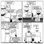
( http://i7.photobucket.com/albums/y280/fitandhappy/JMstrip.jpg : all copyright and, more apropreately, apologys, to the autor etc.)
“… ugly to look at. The lines, the backgrounds, their noses – all an embarrassing mess. ”
Author, you are depicting religion, aren’t you?
I say: let them tidy up their artwork before you do yours.
I’m grateful the eyes will be back.
@ms morbo – that is great. You have given me elbow envy! Cross and crescent bedsteads are a nice touch, too.
If enough other people are interested in having a go with any old strip, I’ll put up a guest art page.
Thanks Author for listening to your fans. I’m delighted that the old eyes will be back.
Morbo: great idea the bedsteads 🙂
I hate to say it, but I liked the old Jesus better too – his wispy gormless quality seemed very fitting. He looks kind of normal now. I’m not sure that’s such a good thing. But I don’t want to be discouraging!
That said, however – author dear, really – the arms are worse than ever! Surely you can do better than that even if you can’t do elbows? Just think of them as plumbing and you’ll do better than those wormy things you’ve stuck poor Jesus with.
You know I say this out of love…
Hey I know what you should do – just have them wear nightshirts in bed, that’s all. Their clothed arms are fine – it’s the naked ones that are scary.
haha – just noticed that Jesus is reading the K’ran!
Is this the koran for dummies version?
@grouchy-one: I think it’s an odd combination of “Koran” (western spelling) and “Qu’ran” (phonetic transliteration from Arabic). The apostraphe designates a glottal stop – like the missing sound when a Cockney says “bottle” (i.e. “boh-ul”).
I wonder if the pub has had a re-fit too? I hope the Cock & Bull hasn’t become some dreadful theme-chain-place. The “Cock and Bull It’s a Scream!” or the “Footage and Cock”, for example 🙁
Apologies to non-Brits for those references.
Just keep ’em coming however the artwork!
Oh no! Don’t you want to reconsider? Or at least give them back their previous expressions? Their new smiling doll faces weaken the fun.
Ophelia, the arms aren’t “wormy”, they are stylised. It’s a different thing altogether!
Oh, alright – I’ll get some elbow practice in and see what I can come up with. No promises, though.
They cannot wear nightshirts. Jesus and Mo always sleep in boxer shorts, without tops. Are you trying to cause some kind of schism?
Dear Author, I would never stop reading Jesus&Mo, but thanks for reverting to their old eyes at least. Your drawings were not ugly and messy before. The waif Jesus really brought out motherly, caring feelings in me for him.
I thought you might all like to share what I read in the Radio Times a little while ago about other nations’ version of I’m a Celebrity and the “stars” they send into the jungle. India: “the Indians brought in a lawyer-turned-actress who had been involved in an extraordinary love affair with a government minister, both of whom converted to Islam in order that he could take a second wife. (Before the minister in question realised his mistake, swapped religions again, and went back to wife number one).”
Unfortunately we were not told if “the other thing” could be reversed.
Well looky here, author, it’s November, and surely Jesus and Mo aren’t so irresponsible as to keep the heat cranked up even at night just so they can sleep in their boxers, so just give them nice warm long-sleeve T-shirts and you won’t have to bother with convincing elbows.
Stylized…that’s a good one. Mmph.
First time commenting. I prefer the old style drawing.
Oh noz !
The “bad” artwork was all the charm. No need for fancy drawing when the jokes are good.
I must admit, it’s going to take me a while to get to like the new art work. The old artwork was part of the charm. However, you’re a genius writer too, so I’m sure the many lols to come will keep me glued, and I may grow to love the new look. That time is not now.
You gotta ask yourself…
What would Jesus do?
You have GOT to at least change the eyes back to what it was before!! Those small dots have absolutely no characteristic at all… But otherwise I think it’s awesome with the new looks! xD
Eugh! Mo now looks like my stepdad. Change it back!
not about the ugliness your authorness, but it’s about brand image. and as a brand developer i’m as sure as hell (don’t know sure about it though) that the previous style has burnt within our chest fellow followers. but i respect you effort nonetheless, so please no stoning.
I also prefer the old style. The sketchiness and bad artistic quality was part of the charm of the strip. I think it would be better if you put your artistic efforts into the backgrounds and props, to make the point that, while the world progresses, religion never does. You could make the rest of the strip detailed, beautifully drawn, or even rendered in realistic 3-D, but keep your two main characters as the original primitive sketches, please. Thanks.
I *liked* the spindly/scratchy Jeebs and M…
I think the original artwork was so crappy that you didn’t notice how crappy it was. The “cleaned up” version just makes your drawing deficiencies more noticeable. Meaning, I never noticed Jesus’ lack of joints before.
You’re previous artwork was “stylized”. Like Cyanide and Happiness. Now you’re just another guy who’s not very good with MS Paint.
I looked up this Daniela woman and I think she’s an awful right-winger, but she is HOT!
‘S true, they do look better with their old eyes. I vote that Jee’s old nose be restored, too. A lot of character sits in the nose, you know. The present one just doesn’t suit him nearly as much as the previous did ;p
Now that the eyes look more “human”, I don’t feel like I’m meeting the new uncanny valley. I enjoy the new look, and would not ask you to go back to the old one.
Ever.
This rocks.
Expressing my great appreciation for evolution AND design (at least on the internet),
C
If I hadn’t read this note, I would never have thought about the artwork or noticed any changes. For me, it’s always been about the dialog here.
Jizmo, I always thought these were actual photographs.
By the way, I have expanded my Christmas line this year: whereas previously you could get a personally autographed and authenticated (by me) photograph of Jesus, I now have two new offerings: one of Mo scowling and holding a liberated Uzi, and a nice triptych of Mary Magdelene in delicous poses. Only $25.00 & $35.00 each, an amost neglible increase over last year. Order now for Christmas!–your local Florida roadside souvenir stand will have, or can order, them for you.
As Po’ Rick says, “Money well invested will create good returns.” (Wut?)
NOOOOOOOO!!!! I WANT THE OLD ART-STYLE BACK!
Me, I’m just grateful for the strip. Ignore the focus group — this isn’t a bleeding Hollywood film.
Author, Don’t worry about the artwork, it fits perfectly. As far as the slight style change, all comic strips change as the cartoon evolves. Take a look at any old Simpsons, Peanuts, Garfield…etc… Things change.
The content is what matters most. And it is great!
Keep up the great work.
Okay, I know I’m late to the party, but… I prefer the old art, especially when it comes to JC. I think his new beard is too short and all his hair is too, well, coifed. I liked the sort of washed-up, disheveled look he had before. It really suited his role in the world today. Kind of like a mangy dog that hadn’t been brushed in forever and had lost a lot of hair. But he still wants you to think he’s every bit as good as that shiny, science-y robot dog over there.
Mo didn’t change as much, but he looks too polished. It’s like (and honestly, I’m no fanboi!) in the matrix when Agent Smith says that the first version of the matrix was perfect and people didn’t like it? Or like early computer animation when it was just too clean and perfect. I like Van Gogh’s sloppy Starry Night over a precise photo.
All that said, it’s your comic and you can draw it how you like and, really, it’s the scripts that matter.
I will say, though, that the focus on the script gave me hope that my webcomic (when I get it set up and all) would be accepted given that your artwork looks like Da Vinci compared to mine. (Heck, my kindergarten daughter’s drawings look like masterpieces compared to mine.)
Thank you, Author, for taking the time to explain to us rabble why you needed the changes. I still love the old artwork (there was something about the imperfect drawings that I thought added to the sheer GENIUS of J&M), but I’m sure I’ll one day grow to love the new look. You’re the artiste; it’s your strip, and it’s not a democracy, so we’re lucky to have had any explanation at all! Keep it coming, whether we prefer the old art or not. Love you, dude/chick!
PS I quite like your crappy arms, elbows be damned!
I’ll tell you what, author – old Jesus didn’t look inept but more like fuzzy in the style of Edward Koren. And fuzzy is right for Jesus! This new one is too definite and too kind of average looking.
Or let me put it this way – old Jesus looked loony, new Jesus just looks dim. Loony is better.
Been reading for a while without commenting. Generally liked the comic and had little use for the comments. FWIW the change in artwork makes this seem like a different (and inferior) comic. The old style was quirky and original. The new one is just generic and boring.
Re: New artwork. First, discovered Jesus and Mo last summer. Love them. Dislike the new artwork, especially the noses and the headwear. They look like a couple of old queens now (No offense meant. I am an old queen myself) However, as I recall, the new artwork showed up right after they made their (unseen) Hallowe’en costumes, so I am rationalizing that the boys liked their costumes so much they declined to take them off. Besides, they noticed they were getting old and, as Quentin Crisp said “It was time to force out the red and force in the blue!”
Still, I wouldn’t mind if you went back. And please, never show the barmaid! There is no way you could fulfill the fantasies of everyone.
Salaam
I say “It’s not about how they look, it’s about what they say!”
But i prefer Jesus’s old beard over his new one. The new one looks fake, de old one looked more authentic. 😉
I loved the old ones 🙁
It’s been over a decade, so it is high time to admit that the J&M author clearly did the right thing by redrawing all the characters and backgrounds. Whenever I run into an old drawing in the “random” archive, it looks sloppy and is very hard to decipher. The new drawings are crisp, and look brilliant in comparison. Best of all is the fact that M’s head no longer resembles the Tower of Pisa (with its pronounced “lean”).